HIDOO - PACKAGING DESIGN
HIDOO - PACKAGING DESIGN
The brief
Making Everyday Food Packaging Impossible to Ignore.
In a category filled with familiar colours, ingredients and product imagery, the challenge was to create a packaging identity that could instantly capture attention. The goal was to give HiDoo Foods a distinctive visual personality that stands out on crowded shelves, connects emotionally with consumers and remains recognisable across a diverse product range.
Turning Visual Attention into Brand Recognition
Food packaging competes for attention in a visually crowded environment. We explored how a simple, expressive visual element could create instant curiosity and make the brand more noticeable.
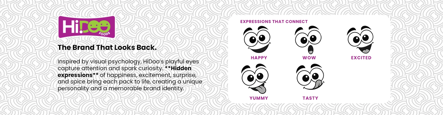
Inspired by the psychology of visual attention, we developed a playful pair of eyes as the brand's signature element — turning ordinary packs into characters that seem to look directly at shoppers.
The magic lies in the hidden expressions. Through subtle changes in eyebrows, eyes and mouths, the characters communicate happiness, excitement, surprise and taste — creating a playful and flexible brand language.
The expressive identity was extended across spices, masalas and breakfast essentials. Distinctive colours, consistent typography and character placement create variety while maintaining a unified brand presence.
